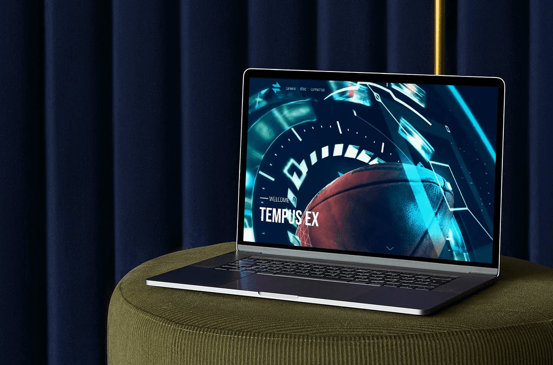
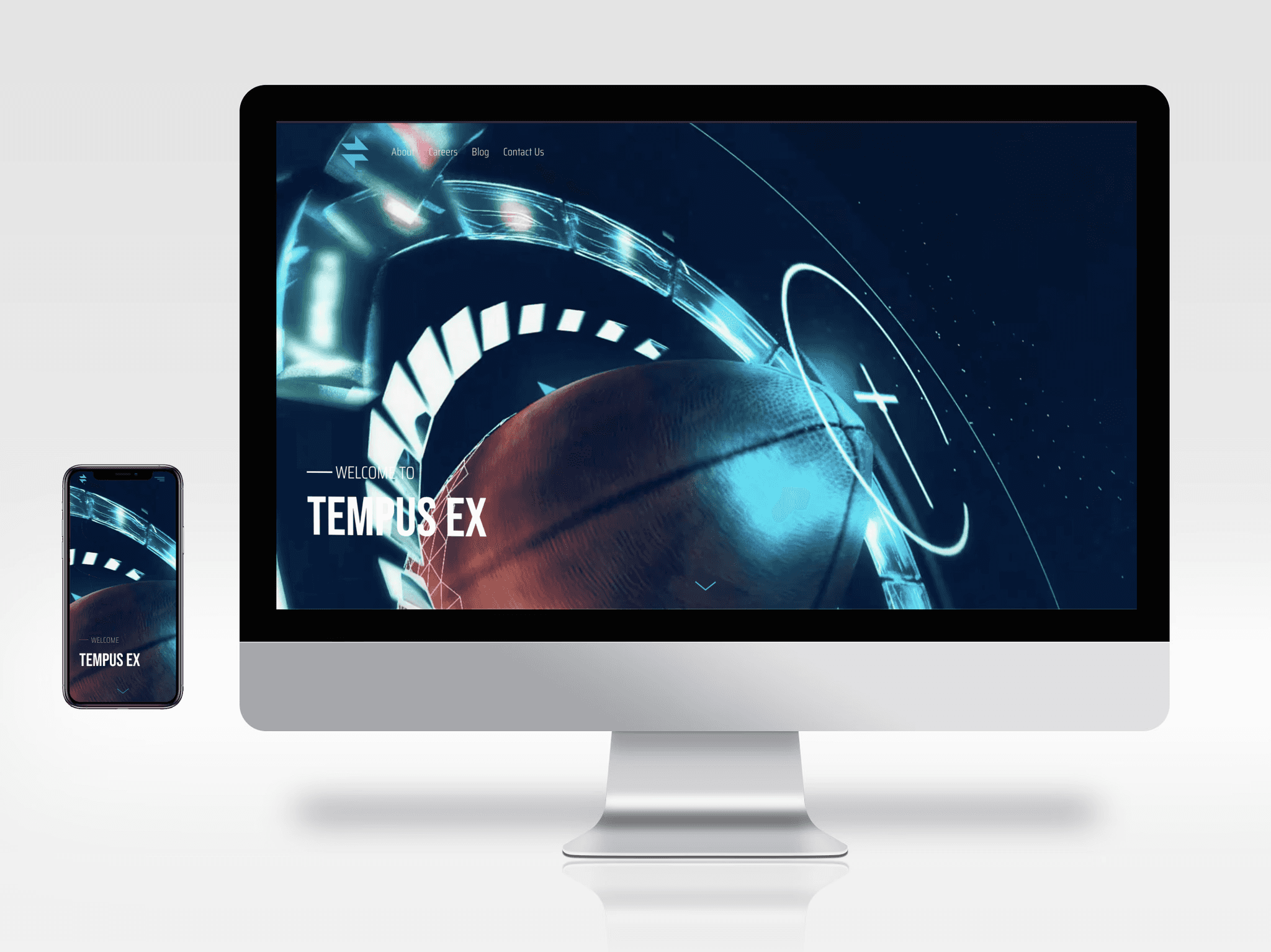
Tempus Ex Machina
UI/UX, website
Problem:
The existing website needed significant improvements to effectively position Tempus Ex to potential candidates and partners. The main issues to address were:
Improve UX: Adjust the website’s layout for a simple and effective user experience.
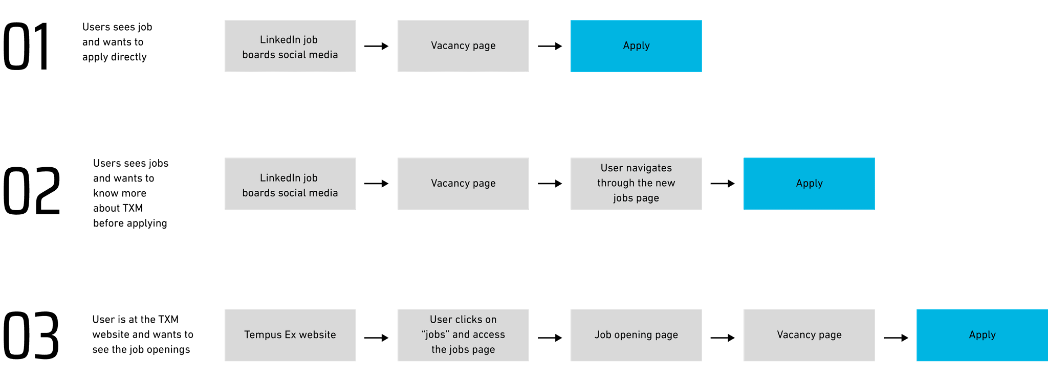
Create Proper User Journeys: Add appropriate CTAs, social links, and resources to showcase expertise and services, triggering user action.
Present the Human Side: Use content, design, and visuals to highlight Tempus Ex's culture and work.
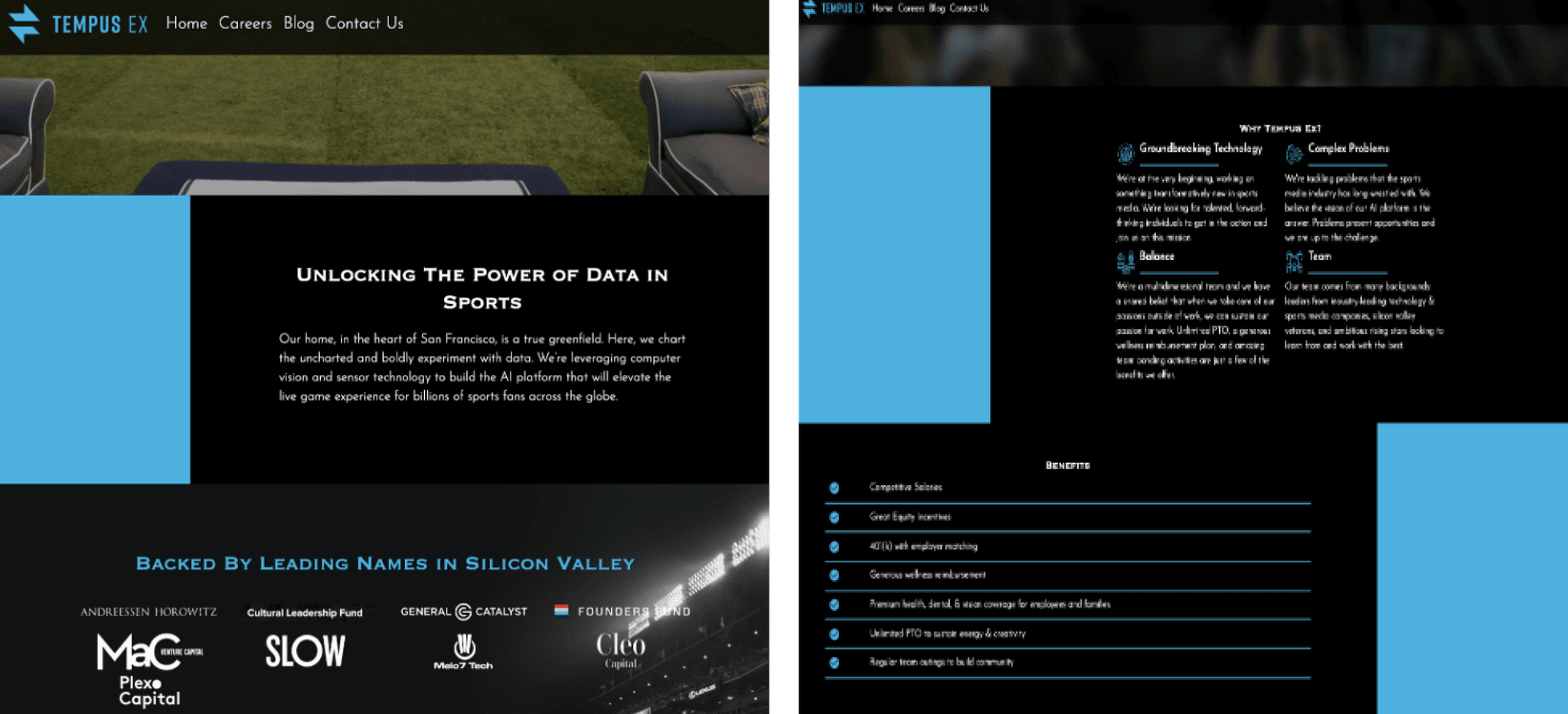
Translate Strategy into Design: Reflect the Tempus Ex 3.0 strategy in a solid design and content.
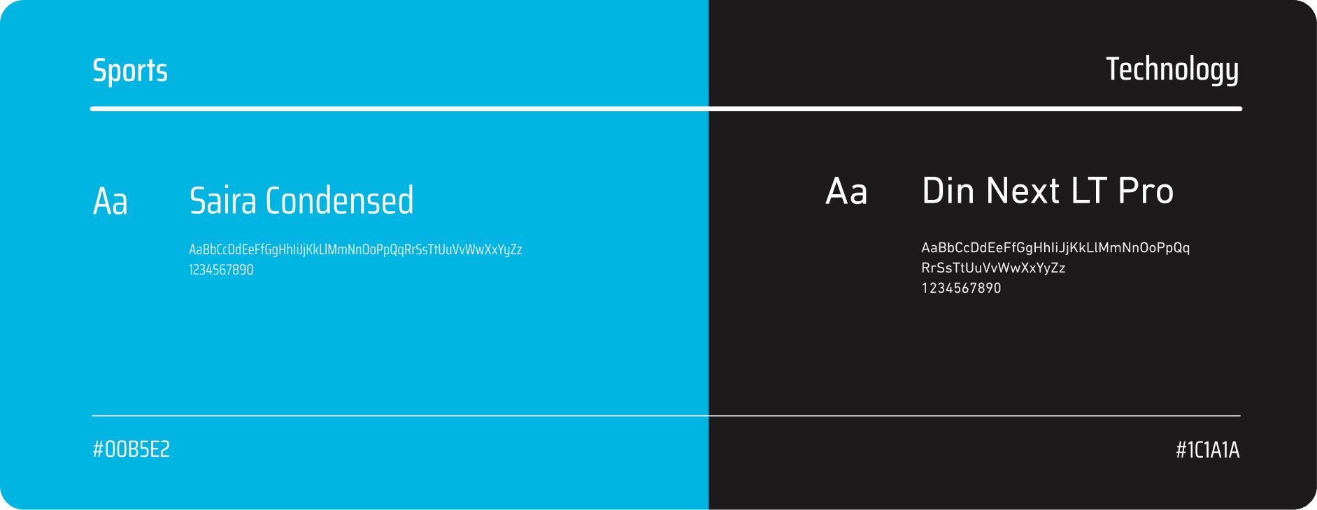
Enhance Brand Consistency: Create consistent branding across the website.
My Role
As a UX/UI Designer at Tempus, my contributions included:
Performing competitive analysis and website audit.
Creating mockups, prototypes, and final UI designs.
Designing content and updating the CMS.
Performing QA after website launch.
Creating visuals for articles and social media campaigns.
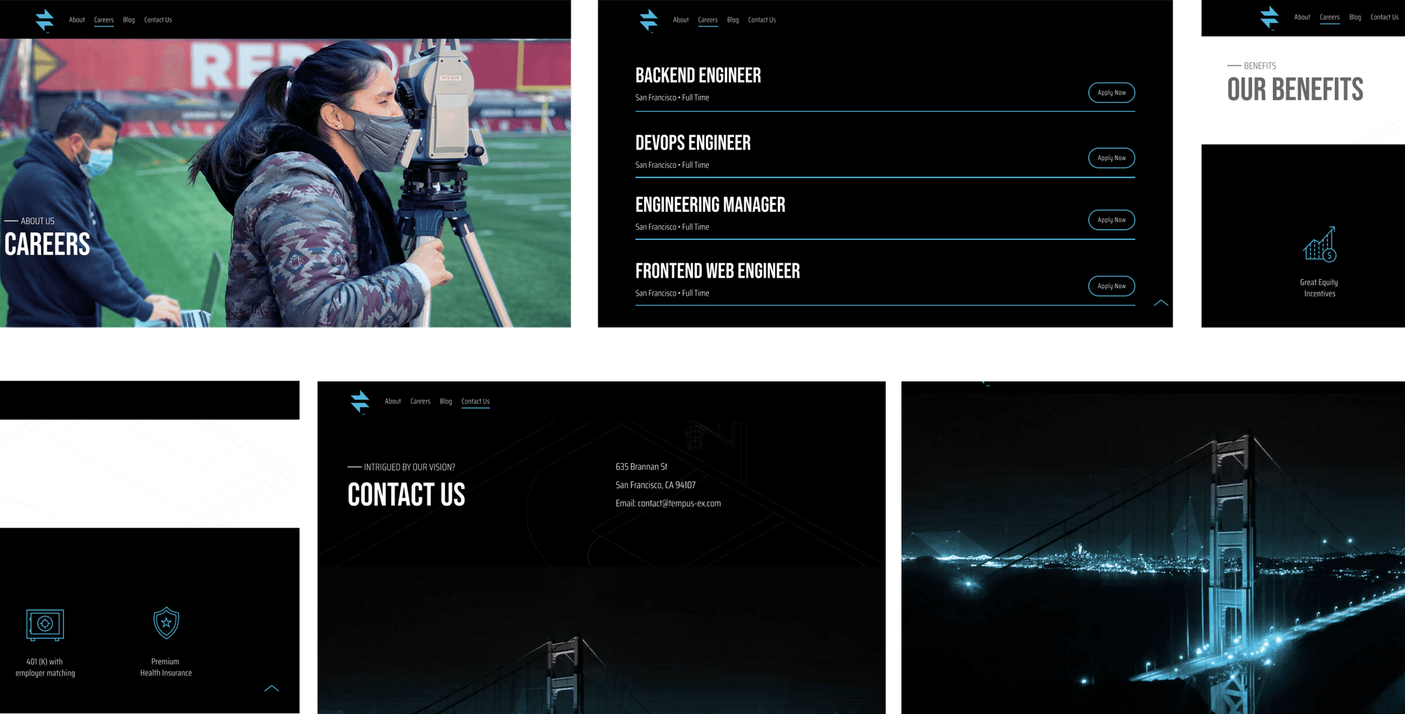
Website Audit and First Sketches: The careers page was the cornerstone of the new website. To ensure its effectiveness, we conducted a thorough website audit. This was crucial to understanding user journeys and integrating new features. The audit revealed the shortcomings of the previous careers page, guiding us in creating a more engaging and informative experience for job seekers.
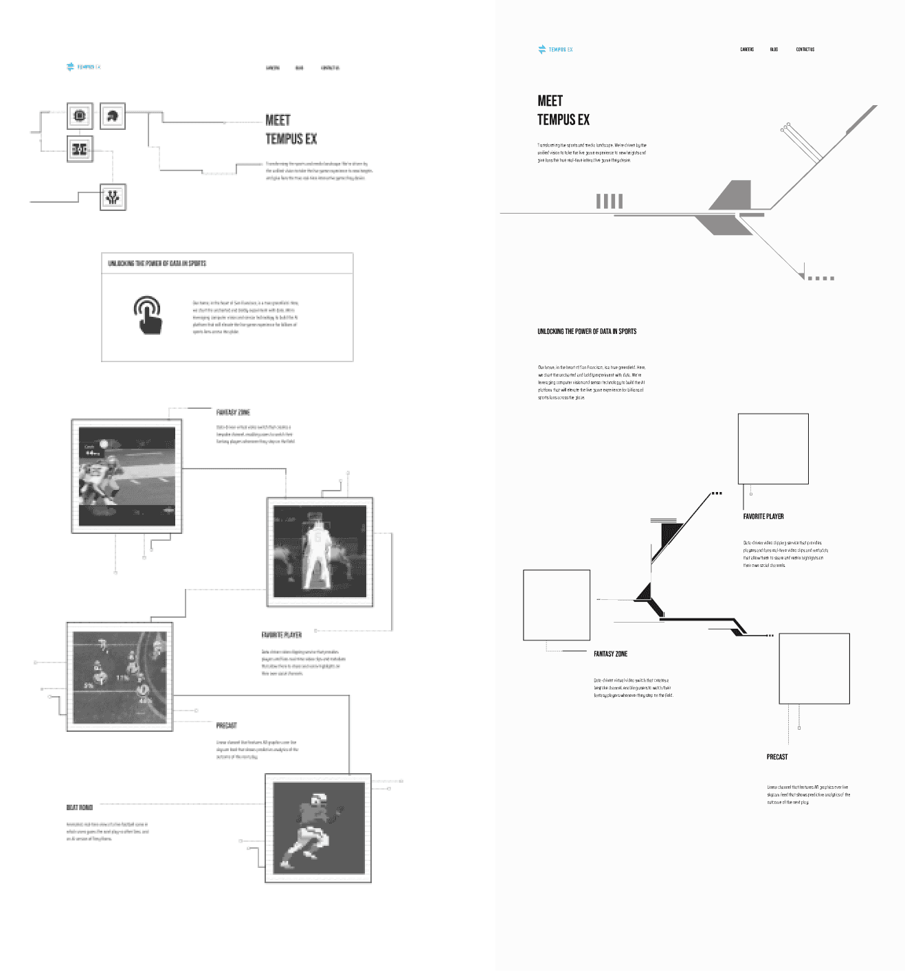
Information Architecture & Userflow: The careers page was created from scratch. With the insights from users’ responses and the competitive analysis, I was able to develop the website's information architecture.
UX Research
To face the creation of a careers page, I started by doing an extensive competitive analysis, followed by user interviews with an online form. These combined led to essential insights that helped with information architecture and improved user flows.
Some of the Findings:
65% of users check company location and flexibility options before applying.
39% want to learn about the people who work at the company.
48% find a lack of clear recruitment process overview frustrating.
35% value company culture highly when looking for a job.
87% consider flexibility the most important benefit.
Solution
Understand: To create an effective careers page and enhance the overall website, we conducted extensive research, including user interviews and competitive analysis. This provided essential insights into user preferences and pain points, informing the design and content strategy.
Analyze: Our analysis revealed key insights that guided the design process, focusing on improving the information architecture and user flows for a seamless experience.
Ideate: Based on these insights, we developed a new information architecture and user flows for the careers page, ensuring a seamless user experience. We created wireframes and content aligned with the new brand positioning and company culture.
Takeaways
• Creativity to Overcome Roadblocks
The biggest challenge of this project was the limitations of the platforms (WordPress and Greenhouse), which had limited customization options. I had to be creative and resourceful, leveraging my front-end skills to find solutions and overcome frustration.
• Alignment with External Parties
Translating traditional copy into UX copy and covering QA for the website launch required extra effort and time. Ensuring alignment with external parties was challenging but essential for a timely launch.
• Branding's Role in Content Design
Disassembling and reassembling branding documents to meet design needs was a significant part of this project. Ensuring brand consistency while creating new content was crucial.
• Users' Perspective is Key
As a real user, gathering insights from others was critical to validate my initial hypotheses. User feedback was invaluable in refining the design and improving the overall user experience.
• Taking Ownership Means Asking for Help
This was my first big project at Tempus, where I led meetings, presentations, organized documentation, and reviewed reports. I also knew when to seek help, ask for a second opinion, or bring in a fresh perspective.
